Brown Paper Branding
/I have always been a fan of brown paper. Brown paper wrapping, cards, packaging, you name it, if it incorporates brown paper, I am instantly drawn to it. There’s just something about the raw and recycled texture and the natural, untreated and grainy aeshetic. Anyone else with me?! Anyway, put brown paper and branding together and all I can say is, be still my beating heart. Here I have collected some of my most favourite brown paper branding designs to share with you.
1. Dead set one of my favourite branding designs yet. I can’t go past good typography. What I like about these designs is that the brown paper isn’t the focus of the designs but rather just compliments the strong typographical elements of the brand. I absolutely love the use of black only - paired with the brown paper, the graphical elements speak for themself - no colour needed.


2. I instantly loved these designs by Oh Babushka, especially the incorporation of the illustrative details. It is simple yet intricate at the same time and creates the perfect balance and contrast of elements.


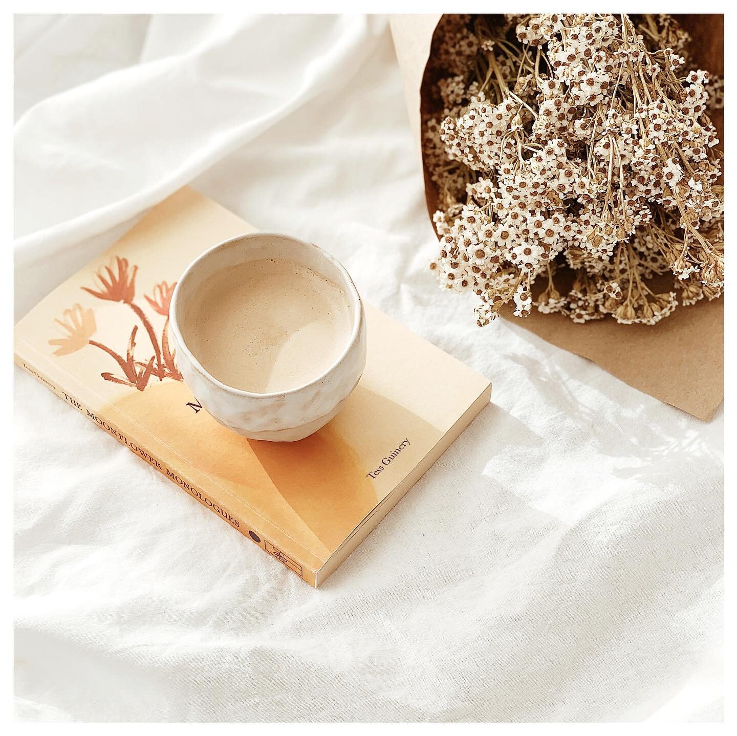
3. Buy me flowers in brown paper any day and it instantly makes my day. Nothing says natural botanics better than brown paper - in my opinion. There is one florist I always go back to not only because she has the freshest and most beautiful flowers but because she wraps the flowers so beautifully in brown paper and green tissue that I almost always just want to keep the flowers to myself. Anyway, back to branding. I particularly like the combination of the green tones in these designs. It compliments the identity and mirrors the product at hand.


4. I was instantly drawn to Moon Mud because of the geometric elements within the design. The introduction of the yellow tones compliments the black and white well and ties all the separate elements in together effectively.


5. Last but not least, love the photographic element that has been incorporated in the Bespoke Trading Co branding. For one, I love the blueish purpleish hues and tones but it also compliments the illustrative aesthetic of the brand.