Friday Finds

Friday-Finds-23.5.14.jpg

Friday Finds is one of my favourite posts I get to share with you. During the week I am constantly searching for and coming across new places, products, blogs, recipes and much much more. So many of them get me excited and inspire me as a creative so it’s only natural I love sharing these findings with you. I learn best and operate visually so a simple image can often spark an idea or inspire a thought.

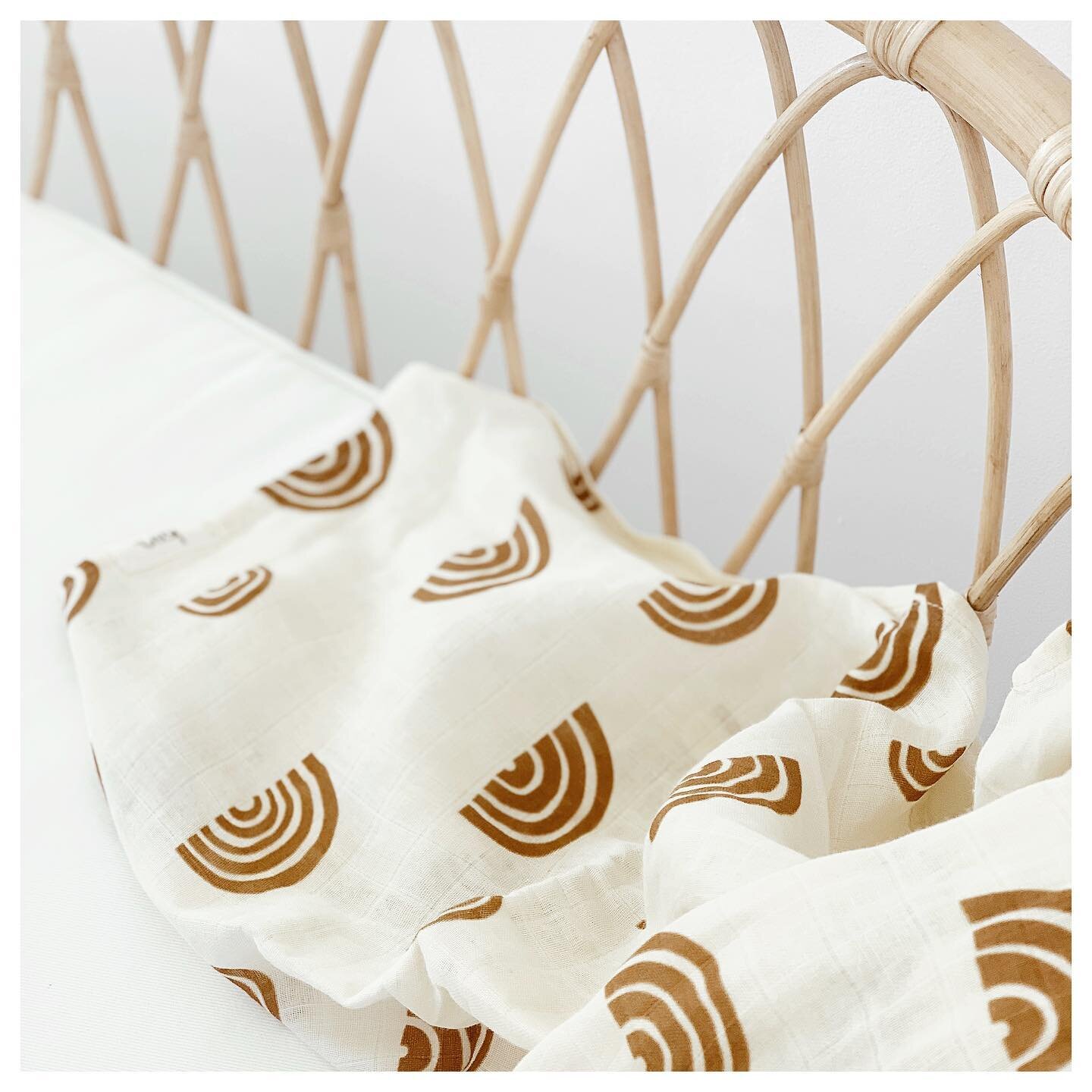
1. How fun is this bedding set?!

2. Boy do I love pretzels. Two years ago we travelled to Europe and I pretty much lived off pretzels in Munich and Berlin. Need to try this pretzel recipe!

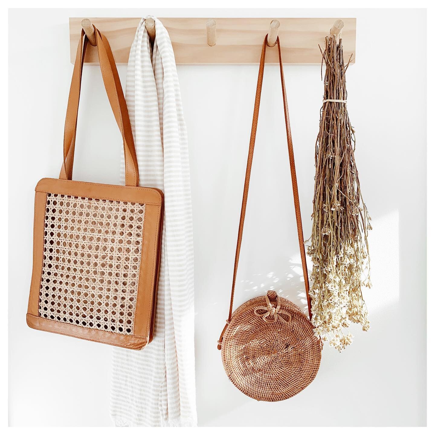
3. This newly discovered store - if only I lived in Brighton!

4. All things Paris inspired on this blog - beautiful imagery has got me wanting to travel back to Europe!

5. Yum yum yum! Will hopefully be trying this granola recipe soon.

6. Wouldn’t mind these simple wedge shelves

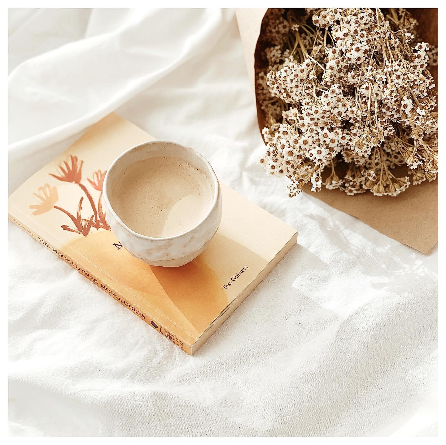
7. These colours together have got my heart singing! Beautiful imagery at this Instagram account.

8. This book (The House Gardener) would be right up my plant-obsessed alley!

All types of dreamy

Things have been hectic lately (good hectic though) - lots going on and lots to think about. This blog has become a space that refreshes me. It's a nice little break from all else that's going on daily - all great things, don't get me wrong, but sometimes it's nice to step away from everything and refuel my creativity. It has been something that we have both enjoyed discussing new ideas for and get excited about daily. Today I'm sharing with you one of my most favourite spaces. Beautifully captured and styled by &Tradition, this space is all types of amazing. Light, bright and plant filled with high ceilings, arched windows, pendant lighting and ornate details.. Oh so dreamy! My favourite element is the large hanging Copenhagen pendant lights.

Untitled-4873-738x1024.jpg

Friday Finds

Friday-Finds-9.5.14.jpg

I can't believe how quickly April passed by and now we're already nearly mid May, unbelievable! Been feeling under the weather all week and just can't shake this cold so tonight I'm looking forward to some much needed down time. This weeks Friday Finds are all things beautiful that have been my distractions this week from everything else that's going on!

1. Recently discovered these guys and want to buy everything on their site! Especially these prints.

2. These beautiful colours together - oh my oh my oh my!

3. This lovely DIY for Mother’s Day (or just for fun!)

4. New Instagrammer to follow!

5. This insightful and helpful post by The Fresh Exchange

6. This wonderful home - so white, bright and airy!

7. Some of you might know my obsession with pineapples - pineapple prints, pineapple imagery, pineapple textiles!

8. These simple business cards

Brown Paper Branding

I have always been a fan of brown paper. Brown paper wrapping, cards, packaging, you name it, if it incorporates brown paper, I am instantly drawn to it. There’s just something about the raw and recycled texture and the natural, untreated and grainy aeshetic. Anyone else with me?! Anyway, put brown paper and branding together and all I can say is, be still my beating heart. Here I have collected some of my most favourite brown paper branding designs to share with you.

1. Dead set one of my favourite branding designs yet. I can’t go past good typography. What I like about these designs is that the brown paper isn’t the focus of the designs but rather just compliments the strong typographical elements of the brand. I absolutely love the use of black only - paired with the brown paper, the graphical elements speak for themself - no colour needed.

tadcarpenter-mrcup-04-cropped.jpg
HuntingLouise_Brown-paper-branding3.jpg

2. I instantly loved these designs by Oh Babushka, especially the incorporation of the illustrative details. It is simple yet intricate at the same time and creates the perfect balance and contrast of elements.

4c54df114e7df694304c9733e59a999f.png
HuntingLouise_Brown-paper-branding.jpg

3. Buy me flowers in brown paper any day and it instantly makes my day. Nothing says natural botanics better than brown paper - in my opinion. There is one florist I always go back to not only because she has the freshest and most beautiful flowers but because she wraps the flowers so beautifully in brown paper and green tissue that I almost always just want to keep the flowers to myself. Anyway, back to branding. I particularly like the combination of the green tones in these designs. It compliments the identity and mirrors the product at hand.

tumblr_mhvawf3riJ1ra3jlho1_1280.png
HuntingLouise_Brown-paper-branding2.jpg

4. I was instantly drawn to Moon Mud because of the geometric elements within the design. The introduction of the yellow tones compliments the black and white well and ties all the separate elements in together effectively.

mmlogo.jpg
HuntingLouise_Brown-paper-branding4.jpg

5. Last but not least, love the photographic element that has been incorporated in the Bespoke Trading Co branding. For one, I love the blueish purpleish hues and tones but it also compliments the illustrative aesthetic of the brand.

cd0237ff4fb63e4957d8ed66b80d9920.jpg
HuntingLouise_Brown-paper-branding5.jpg